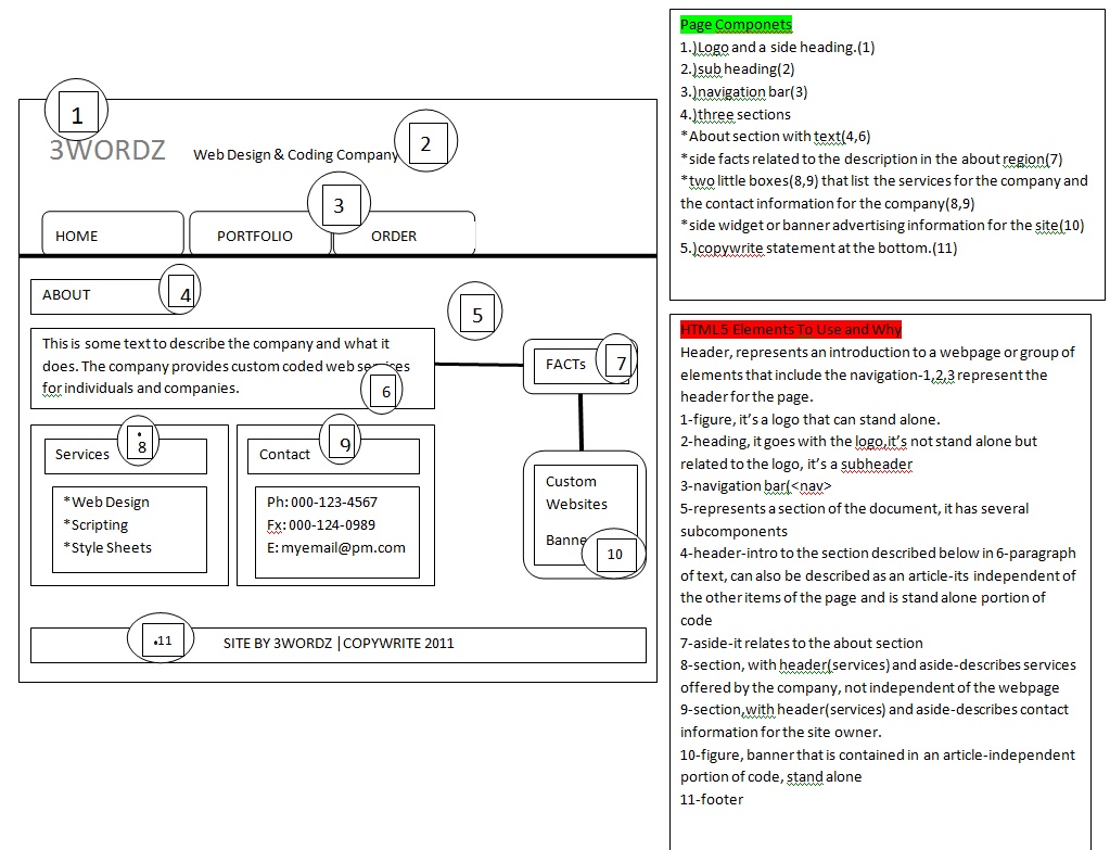
Your graphical representation seems rather confusing, but i will try to give you some basic principles, so that you will be able to apply those on the layout you want.
Your
header element can contain a logo, and optionally a horizontal navigation mechanism, marked up by a ordered list, which is styled with
CSS to give the appearance of tabs.
The
header could contain information, such as a link to your
about page,
privacy policy, and
contact page, etc.
Your main content should be marked up with an
article element, which begins with a
h1 header, followed by potential subsections. An example is shown below.
- Code: Select all
    <article>
       <h1>Example of how to use the article element</h1>
       <p>Main blog post, article, etc..</p>

       <section>
        <h1>Subsection of article</h1>
        <p>A subsection of the main article.</p>

        <section>
         <h1>This is a subsection of the first subsection</h1>
         <p>This is a subsection to a subsection</p>
        </section>
       </section>
    </article>
Above should be placed in your
body, and can be styled any way you please with
CSS.
The navigation should be indicated by
nav elements, just keep in mind that some links, such as breadcrumb-links in your content, shouldn't be marked up using
nav.
Your
footer can be used for copyright information, and contact information.
Keep in mind that many elements are optional, but recommended where it makes sense to include them. If you don't have anything which contributes to your site as a
footer, then don't use the
footer element.[/b]
